

Choosing the right colours for wall art can transform any space in your home. Whether you’re looking to create a calming atmosphere in your bedroom or add a pop of energy to your living room, the colours you pick play a crucial role. I’ve spent a lot of time exploring different palettes and their effects on mood and style.
In South Africa, where natural light and vibrant landscapes influence interior design, selecting the perfect hues for your wall art becomes even more important. You want colours that not only complement your décor but also resonate with your personal style and the unique character of your surroundings. Let’s dive into how you can make the best choices for your space.
Importance Of Colour In Wall Art
Colour in wall art isn't just about aesthetics. It plays a pivotal role in setting the tone of a room. Imagine coming home after a long day to a space filled with vibrant, lively hues. It instantly lifts your mood. Now, picture a serene blue piece in your bedroom. Doesn't it make you feel calm and ready to unwind?
At https://eyahomeliving.co.za/, you'll find a stunning collection of wall art that exemplifies this balance. For instance, a friend of mine recently bought a piece with warm, earthy tones from Eya Home Living. She placed it in her living room, and now the whole space feels more inviting and cosy. It's incredible how just the right shades can transform an area.
There's also research supporting the psychological impacts of colour. A study published in "Colour Research & Application" found that colours like blue and green can reduce stress, while yellow and orange can boost energy levels. Think about that abstract orange painting you've been eyeing for your home office. That extra pop of zest might be just what you need for those productivity boosts.
Let's not forget about how natural light interacts with colours. In South Africa, with its abundance of sunlight, the colours in your wall art can look different throughout the day. I once hung a deep red canvas in a well-lit room, and the way it shifted tones from morning brightness to evening shadows was mesmerising. This dynamism adds an additional layer of beauty and complexity to your decor.
Eya Home Living provides a variety of options to suit different lighting conditions and room atmospheres. If you're unsure about which colours to choose, think about the function of each space. In a living room, perhaps you'd want dynamic and warm tones to foster social interactions. Conversely, in a bedroom, cool and muted shades can promote relaxation.
When curating wall decor, personal style is key. Trust your instincts and choose pieces that resonate with you. After all, your home represents you. And if you ever feel stuck, a quick browse through Eya Home Living's website might just spark the inspiration you need. Enjoy the journey of transforming your space with the perfect wall art.
Understanding Colour Theory
Hey there! Choosing the perfect colours for your wall art can turn any room from drab to fab. Now, let's dive into some essential aspects of colour theory to help you make informed choices.
Primary And Secondary Colours
Primary colours are the fundamental pigments: red, blue, and yellow. Imagine these as your basic ingredients in the kitchen of colour. You mix them to create secondary colours. Pair red and blue to get purple. Combine blue and yellow, and voilà, green appears. These combinations form the foundation of wall art design.
Think about a time when you walked into a friend’s house and felt instantly relaxed. Chances are, they used the right mix of primary and secondary colours. You might even catch yourself saying, “Wow, this blue and yellow combination really makes the place pop!”
Warm And Cool Colours
Warm colours like red, orange, and yellow can make a room feel energetic and inviting. They’re perfect for spaces like living rooms or dining areas where you entertain guests. On the flip side, cool colours like blue, green, and purple create a calm and soothing atmosphere, ideal for bedrooms or offices. Picture yourself sinking into your sofa at the end of a long day, wrapped in a room filled with cool blue tones. Ah, bliss.
Ever thought about why that piece of wall art in your living room makes you feel lively? It’s all about those warm hues. Once, I chose an orange and red painting for my dining room. Every meal felt like a festive occasion. Visit Eya Home Living to check out some vibrant wall decor options. Your guests might not want to leave!
Colour Harmony
Colour harmony is all about creating balance. It’s like hitting the perfect chord in music; everything just feels right. Use complementary colours (opposite each other on the colour wheel) for a vibrant look. Alternatively, analogous colours (next to each other on the colour wheel) offer a more subtle, cohesive feel.
Imagine chatting with your partner, “Does this room feel off?” Then you tweak the colours to find that perfect harmony. Sudden peace, right?
A pro tip I learned: try using a triadic colour scheme, where three colours evenly spaced on the colour wheel come into play. It sounds tricky, but it’s magic when done right. I once used a triadic scheme with green, orange, and purple. My home office was a hit, and productivity soared.
Feeling inspired? Trust your instincts and experiment with different palettes. Visit Eya Home Living to find wall art that complements and enhances your space.
Popular Colour Choices For Wall Art
Choosing wall art can completely redefine a space. Imagine walking into a room and feeling an instant sense of calm or excitement—just from the colours on the wall. Let’s explore some popular colour choices for wall art that can transform your home.
Neutral Colours
Neutral colours like white, beige, and grey offer a timeless appeal. They’re perfect if you want your wall art to have a sophisticated, understated elegance. I remember helping a friend choose wall art for her new flat. She wanted pieces that could blend seamlessly with her modern decor. We stumbled upon a stunning abstract painting in shades of grey at Eya Home Living. "This is perfect," she said, her eyes lighting up. The neutral tones added a chic vibe to her space without overwhelming it.
Neutral colours are versatile. You can easily update your room's look without having to change the wall art. A study by the University of Westminster even found that neutral tones in interiors can create a sense of clarity and calm, reducing stress levels.
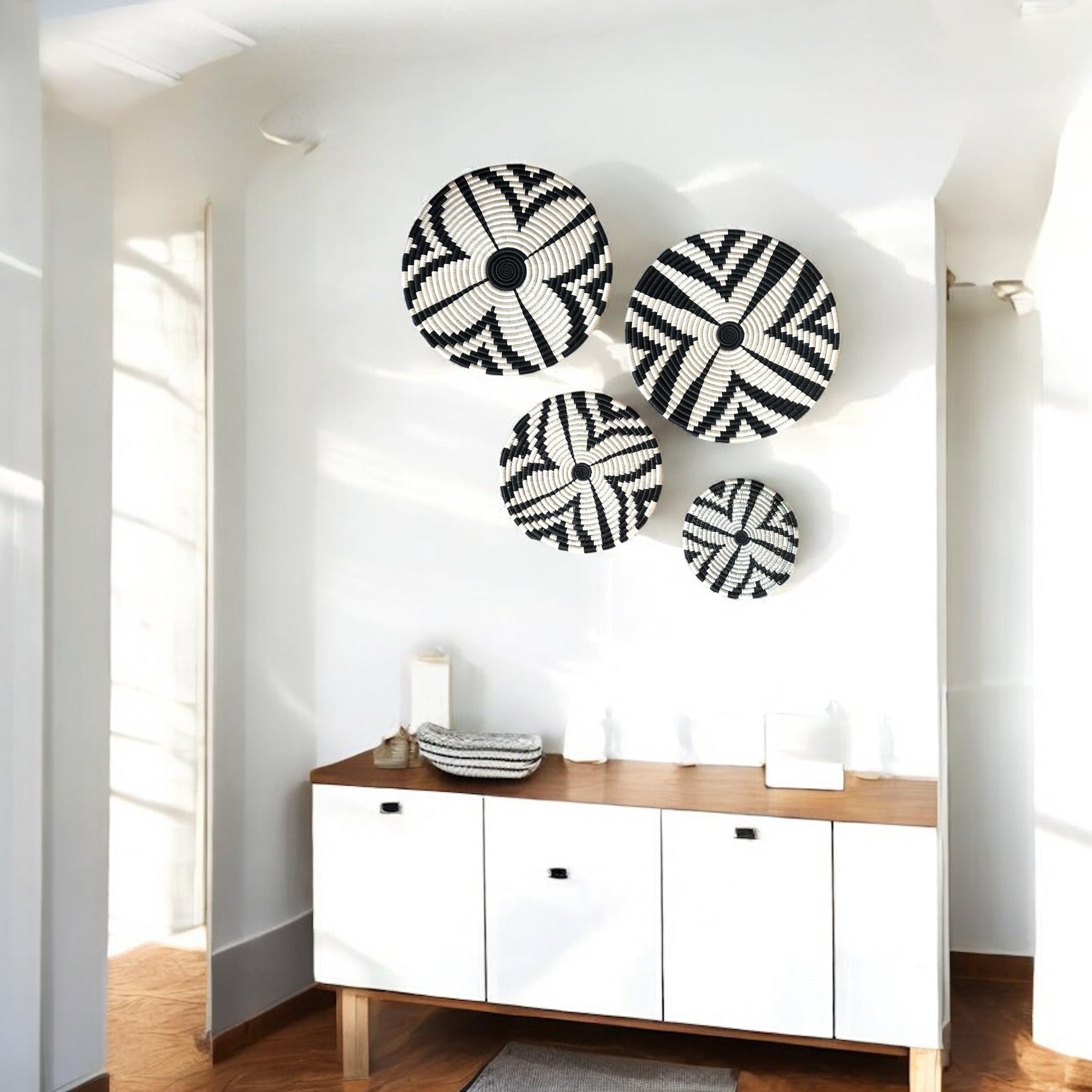
Bold And Vibrant Colours
If you’re someone who loves energy and vitality, bold and vibrant colours are your best bet. Think of reds, blues, and yellows that pop. These colours can inject a sense of enthusiasm and personality into your space. Picture this: you’re having a not-so-great day, but then you walk into your living room and your eyes land on a vibrant, colourful piece of wall art—it’s like an instant mood booster!
Eya Home Living has an amazing collection of vibrant wall art. I once bought a bright red and orange abstract piece from them for my study. A friend came over and exclaimed, “Wow, this makes the room come alive!” Indeed, bold colours can dramatically transform a room’s atmosphere.
Earthy Tones
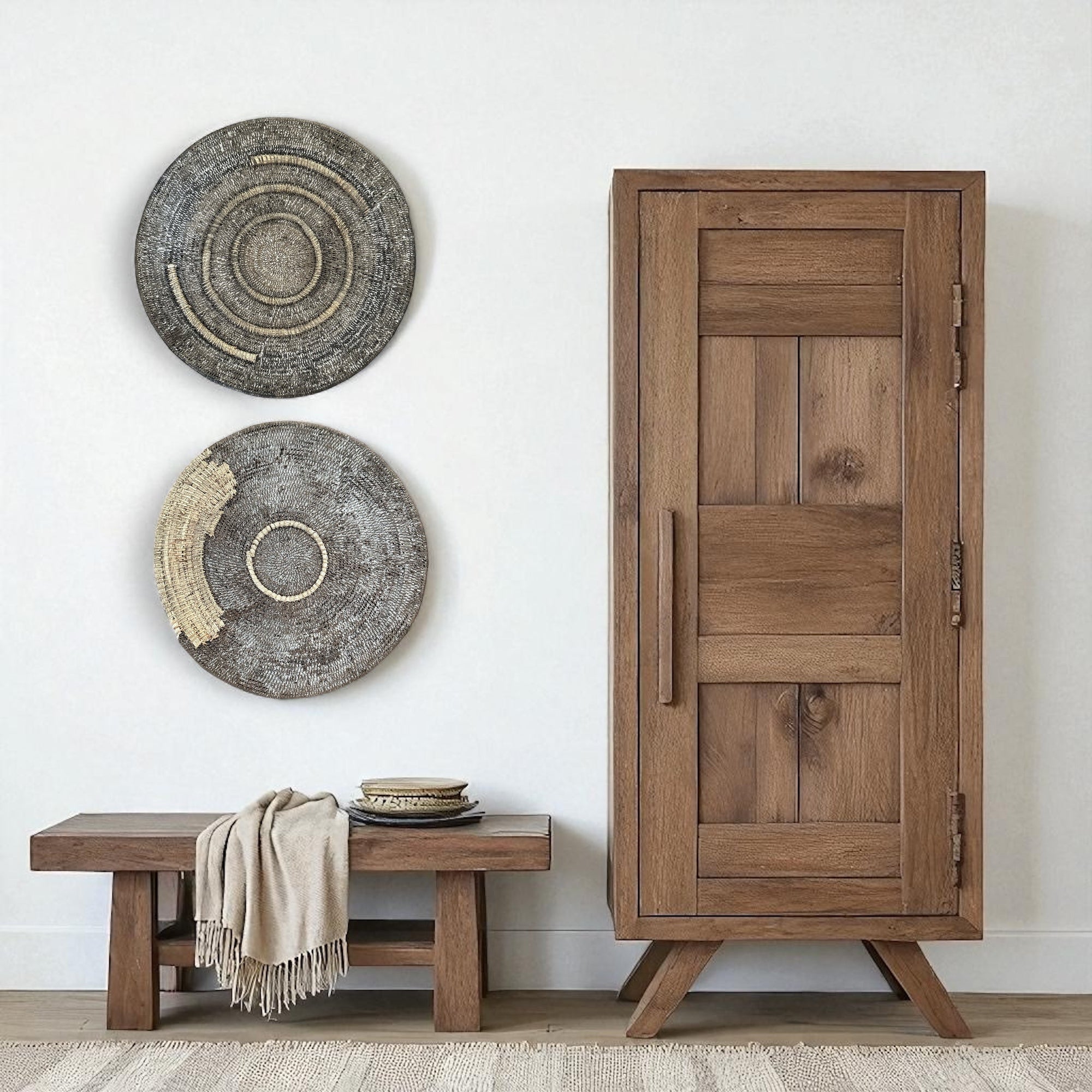
Earthy tones like browns, greens, and muted oranges bring warmth and a touch of nature indoors. These colours are fantastic for creating a cosy and inviting space. When you think of earthy tones, think of autumn leaves or the soothing hues of a forest.
A few months ago, I helped another friend select some wall decor for her cottage. We found beautiful pieces with rich, earthy tones on Eya Home Living’s website. Hanging those artworks gave her living room a warm, inviting feel. “It’s like bringing a piece of the outdoors inside,” she said, beaming with joy.
According to colour psychology expert Angela Wright, earthy tones can create a grounded and reassuring environment, making them perfect for spaces where you want to relax and unwind.
In essence, the right colour choice in wall art can elevate your home's style and impact your mood. Whether you choose neutrals, bold hues, or earthy tones, exploring the collection at Eya Home Living will inspire you to find the perfect pieces for your space.
Choosing Colours Based On Room Function
Ever thought about how different shades can set the mood in your home? Let's dive into how wall art can transform each room by picking the perfect colours.
Living Room
The living room, often the heart of your home, benefits from wall art that encourages both relaxation and social interaction. Think bold yet inviting colours like deep blues and rich terracottas. Imagine you’re hosting a get-together, and the walls feature a stunning piece from Eya Home Living's collection. Your friends might ask, "Where did you find that gorgeous artwork?" The colour isn't just a backdrop; it adds character and warmth to every conversation.
Remember, it’s not just about bright colours. Muted tones can work wonders too. A large abstract piece in subtle greys can create a sophisticated atmosphere that makes everyone feel comfortable.
Bedroom
In the bedroom, wall art plays a crucial role in creating a serene haven. Soft, calming colours like pastel blues, gentle greens, and even shades of lavender are ideal. Picture this: After a long day, you retreat to your bedroom and are greeted by a peaceful landscape painting with soothing colours. You might even say, "This is my sanctuary." The right wall art makes this moment possible.
To add a personal touch, consider custom pieces. Eya Home Living offers unique options that reflect your style, making your bedroom truly your own.
Kitchen
Wall art in the kitchen? Absolutely. Kitchens aren't just for cooking; they’re also social spaces. Here, lively colours like sunny yellows or warm oranges can energise your mornings. Imagine you and a friend catching up over coffee, with vibrant art pieces bringing a pop of joy to the room. Your friend might say, "This art really brightens up your kitchen!"
Don't forget that functional spaces deserve beautiful decor too. Even small prints or colourful tiles can elevate the kitchen's appearance, making it a charming and inviting place to start your day.
By considering the function of each room, you can select wall art colours that not only enhance aesthetics but also complement the room's purpose. Whether you're redecorating or moving into a new space, Eya Home Living has a range of options tailored to meet these needs. Why not explore their collection and find the perfect piece for each room?
How To Mix And Match Colours
Picking colours for wall art can be like standing in front of a vast buffet—you've got loads of delicious options, but where do you start? Let's break down how to mix and match wall art colours to transform your space into something truly spectacular.
Complementary Colours
Ever tried mixing complementary colours? They're like the dynamic duos of the colour world. Complementary colours sit opposite each other on the colour wheel—think red and green, blue and orange, yellow and purple. In wall art, this pairing creates high contrast and vibrant visuals. For example, if you've got a bold red painting, why not add a piece with green accents? This duo makes each colour pop!
Imagine you’ve got a contemporary living room. You could use a striking blue piece from Eya Home Living, then complement it with an orange-toned abstract artwork from the same collection. You'd amaze your guests with the visual harmony!
Analogous Colours
Analogous colours sit next to each other on the colour wheel and offer a more subdued, harmonious look. Think of them as a family reunion—these colours naturally get along. For wall art, this means you can create a soothing and cohesive mood. Grab a landscape painting with various shades of green, and pair it with some smaller pieces featuring blues and yellows from Eya Home Living.
Let’s say you want to make your bedroom a serene haven. Go for pastel pinks, purples, and blues. A lavender abstract beside a soft pink floral piece will make your space dreamy and peaceful—because who doesn't want to sleep surrounded by calm vibes?
Triadic Colours
A triadic colour scheme involves using three colours that are evenly spaced around the colour wheel. This combo offers both balance and vibrancy. Think of it as having your cake and eating it too. A triadic setup can inject energy and life into a room without overwhelming it.
Picture this: Your kitchen needs a bit of a facelift. You pick a triadic scheme of red, blue, and yellow. Maybe a vibrant red fruit print from Eya Home Living complements a cool blue geometric piece and a cheerful yellow sun pattern. That's a recipe for a visually satisfying kitchen!
Is your head buzzing with ideas yet? Mixing and matching wall art colours might seem daunting, but with a little knowledge and some stunning pieces from Eya Home Living, it's totally achievable. So, what’s stopping you? Dive into that colour wheel and start transforming your home today!
And seriously, if you’ve got questions or need advice, drop a comment! Sometimes a second opinion can spark the best ideas.
Conclusion
Choosing the right colours for wall art can truly transform your home. It's not just about aesthetics; it's about creating an atmosphere that suits each room's purpose. When you consider factors like natural light and personal style, you can make informed decisions that enhance your living spaces.
From calming bedrooms to energetic living rooms, the right colour palette can make all the difference. Don't hesitate to experiment with different combinations and take inspiration from trusted sources like Eya Home Living. Their diverse collection can guide you in finding the perfect pieces to elevate your home's style and mood.
Frequently Asked Questions
-
How do I choose the right colours for wall art in my living room?
To choose the right colours for wall art in your living room, consider the atmosphere you want to create. Bold and vibrant colours like deep blues, rich terracottas, or vibrant oranges can make the space energetic and inviting. On the other hand, neutral or muted tones such as greys can create a more sophisticated and relaxing environment. Eya Home Living offers a wide range of wall art to suit your style and preferences.
-
How does natural light affect the appearance of wall art colours in South Africa?
In South Africa, the abundance of natural sunlight can change the way wall art colours look throughout the day. For example, a deep red canvas may appear bright and dynamic in the morning sunlight and more subdued in the evening shadows. When choosing wall art, it's essential to consider how the natural light in your home will interact with the colours to add depth and complexity to your decor.
-
What are the best wall art colours for a calm bedroom atmosphere?
For a calm and serene bedroom atmosphere, opt for soft, cool colours like pastel blues, gentle greens, and shades of lavender. These colours promote relaxation and create a peaceful environment that helps you unwind. Eya Home Living offers a variety of calming wall art pieces that can transform your bedroom into a tranquil sanctuary.
-
How can I use complementary colours in wall art?
Complementary colours are colours that sit opposite each other on the colour wheel, such as blue and orange or red and green. When used in wall art, complementary colours create a vibrant and high-contrast visual effect, making each colour stand out. For example, pairing a bold red painting with a green-accented piece can make a striking statement in your room. Check out Eya Home Living for pieces that feature complementary colour schemes.
Earthy tones include colours like browns, greens, and muted oranges, which bring warmth and a natural touch to your home. These tones are perfect for creating a cosy and inviting atmosphere, especially in spaces like living rooms or cottages. They evoke a sense of nature and grounding, making them ideal for relaxation. Explore Eya Home Living’s collection of earthy-toned wall art to add this warm, welcoming vibe to your space.